

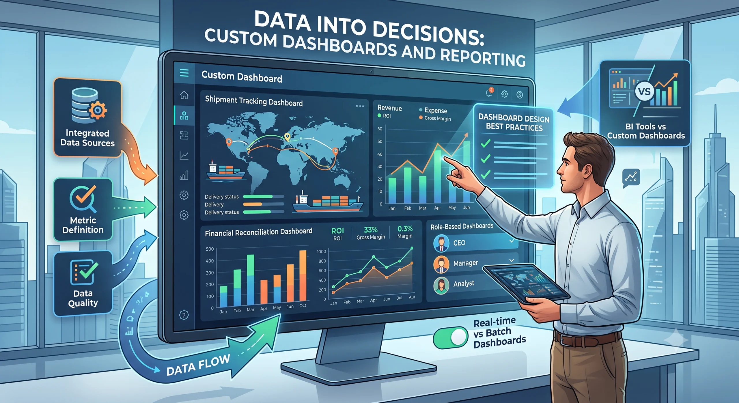
Why Off-the-Shelf Dashboards Fail We have walked into enough companies to know the pattern. There is a TV on the wall showing a dashboard nobody looks at. It was bought from a vendor or built from a template. It has twelve charts. Nobody can explain what three of them mean. Off-the-shelf dashboards fail because they are built for an average business that does not exist. Your finance team defines revenue differently than your sales team. Your operations team cares about shipment exceptions, not totals. The generic dashboard shows totals. The result is predictable. People open it once, find it useless, and go back to their spreadsheets. The dashboard becomes wallpaper. Here is what generic dashboards get wrong: They show metrics someone else defined, not the ones your team argued about for three months They assume a standard data model, but every company has quirks in how data is stored and labeled They prioritize looking impressive over being useful They cannot adapt when your business process changes A dashboard is not a trophy. It is a tool. If it does not help someone make a decision or do their job faster, it has failed. The Dashboard Trap: Building for the Wrong Audience The most common mistake we see is this: a dashboard is built for executives, approved by executives, and then handed to operators who never wanted it. Executives want the high-level view. Total revenue, monthly trends, top customers. That is fine for a Monday morning glance. But the person actually doing the work needs different information. They need to know which shipment is stuck at customs, which invoice does not match its purchase order, which employee has not logged hours for three days. The dashboard trap happens when nobody talks to the people who will use the dashboard daily. The executive sponsor is happy because the numbers look good in the demo. Three weeks later, usage drops to zero. We learned this the hard way on an early project. We built a beautiful executive dashboard with fifteen charts. The CEO loved it. The operations team never opened it. When we asked why, they said: “None of those numbers help me do my job.” We rebuilt it from their perspective. We asked what questions they had at 9am every morning. We built the dashboard around those questions. Usage went from zero to daily. The lesson: build for the person who opens it every day, not the person who approved the budget. How to Design Dashboards People Actually Use Start with the question, not the data. This is the single most important rule. Most dashboard projects start with: “We have all this data, let’s visualize it.” That is backwards. You end up with charts that exist because the data exists, not because anyone needs them. Here is the process we follow: Talk to the people who will use the dashboard daily. Not their manager. Them. Ask what decisions they make in a day and what information they need to make those decisions. Write down the specific questions the dashboard must answer. Rank the questions by importance. Build only enough charts to answer those questions. A good dashboard answers questions. A bad one raises them. Other design principles we follow: One screen, no scrolling for the most important information The top-left chart gets the most attention, so put the most urgent metric there Use color for status (green, yellow, red), not decoration Remove any chart that nobody has looked at in the last two weeks Show the trend, not just the current value, so people can see direction Metric Definition: Why “Revenue” Means Five Different Things Before you build a single chart, you need to define your metrics. This is where most projects stall. Ask your finance team what revenue is. They will say: recognized revenue, booked in the general ledger, excluding taxes. Ask your sales team. They will say: total contract value signed this month, including future commitments. Ask your operations team. They will say: invoiced amount for goods shipped this month. Three teams, three definitions, one word. If you build a dashboard without resolving this, you will have three people looking at the same chart and arguing about whether the number is right. We run a metric definition workshop before building any dashboard. Here is what it covers: The exact formula for each metric The source system and table What is included and excluded Who owns the definition How often it is refreshed This is not glamorous work. It is the difference between a dashboard people trust and one they argue about. Role-Based Dashboards: Different Views for Different People A single dashboard cannot serve everyone. Role-based dashboards solve this. Executive Dashboards Executives need: trends, comparisons to targets, exceptions that need attention. They look at the dashboard weekly or monthly. They want to know if something is off-track, not the details of why. Charts that work: trend lines, KPI scorecards, variance against target, top-five exceptions. Manager Dashboards Managers need: team performance, bottlenecks, items requiring action. They look daily. They need to spot problems early and assign work. Charts that work: team workload, cycle times, aging reports, exception lists. Operator Dashboards Operators need: their specific work queue, what to do next, what is blocking them. They look hourly or constantly. They need actionable items, not analysis. Charts that work: task lists, status boards, alerts, item-level detail with drill-down. The same underlying data feeds all three. The difference is what each role needs to see and do with it. Real-Time vs Batch: When You Need What Not everything needs to be real-time. This is a common and expensive misconception. Real-time data is necessary when: A delay causes a problem (a shipment stuck at customs needs attention now, not tomorrow) An operator takes action based on current state (a dispatch team routing trucks) You are monitoring for exceptions that escalate quickly (fraud detection, SLA breaches) Daily or batch data is fine when: The decision cycle is daily or slower (monthly revenue review, weekly team


